Friday, December 9, 2011

Pigment Properties Chart: Waterproof India Ink, Pigment Swatch and lift out

If you really want to know what a pigments properties are or  I also call them personalities make a Color Properties Chart.  Start with waterproof India Ink. Let this dry bone dry. Using your one inch 995 Winsor Newton flat water color brush, lay down a 3" swatch of pigment across the India Ink. 
  • If it disappears its basically a transparent watercolor and will lift out easily on watercolor paper.  
  • If it makes the India Ink darker it is a stain and it difficult to lift out in a watercolor painting. 
  • If it leaves a film its is opaque and will set heavy on your watercolor paper.
Note the small white line above the black India Ink  this was lifted out using a 995, 1/2" Winsor Newton flat watercolor brush.  If the pigment doesn't lift out well you know it has stain properties. Note the bottom left Manganese Blue the line came off to pure white paper. This is very transparent and lifts easily from your paper.
This knowledge helps you orchestrate your watercolor design and will make you a master painter.

Mixing Purples, Oranges and Greens from primary hues.


Mixing Purples: Reds are placed along the top. Blues and one green with a blue undertone on the left side. Note how some mixtures are pure neutrals with separation of pigments as they dried. Some wonderful Red Violets emerged and Blue Violets. Some Blue mixtures of blues simple were just blue. Look at the separation qualities of some of the pigments.  Some pigments are heavy and settled to the bottom while other pigments are light and set on top of the mixture. A Happy Experience.


Mixing Oranges.  Warm Yellow Hues are place along the top. Red Hues are placed on the left side. Follow the line of color to see what mixed Hues are made from two different pigment


Mixing Greens Note the different warm tones along the top of the page used for a green Hue mixture. Cool colors were placed to the left. Pigments were then mixed. Fascinating how some pigments are transparent and pure other are have granulation properties others opaque.


About these mixtures: There are many different books with exercises to mix secondary colors. It is of up most importance that you create your own charts with the pigments that you like and have preference too.
Then these mixtures become your own and you will have knowledge of how best to orchestrate them on your design.

Wednesday, November 30, 2011

Composition Devices and Resource Reconstruction

Compositional Devices
Ways in which artist can organize the elements and principles of design are called a composition device.
Like Music and Writing, Compositions fall into categories:

The Definition of a cat·e·go·ry/ˈkatəˌgôrē

NOUN:
  1. A class or division of people or things regarded as having particular shared characteristics: "five categories of intelligence".
  2. One of a set of classes among which all things might be distributed
   Music categories : Classical, Western,Modern, Rock, Gospel and Ballads
Writing Categories:  Fiction, Biographies, Romance, Narrative, Memoir, Poetry, Short Story, Speeches.
Composition categories: Steel Yard, S or Compound Curve,  Horizontal Bands,Vertical Bands, Framing or Arabesque, Cruciform also called  Crossroad or Hanging T, Checkerboard, these are just a few.
Steel Yard
 
S or the Compound Curve
Horizontal Bands
 

    Monday, November 28, 2011

    Salt Lake City Temple. Temple Square Salt Lake City Uath

       This is the Salt Lake City Temple at Christmas time. The Salt Lake Temple is in, of course in Salt Lake City, Utah, United States of America.   My Great Grand Parents helped build this temple, it took forty years. The Temple is a sacred house of the Lord Jesus Christ.
    The photo was taken by my husband Dr. Jay T Ellis "HTC, Droid Incredible" Cell Phone.

    Thursday, November 17, 2011

    Wet in wet and direct painting method. Sunflower resource

    Wet in wet process. The large sunflower was left white by painting water around the flower then adding pigment into a wet in wet method. 
    This is four steps into the painting.


    Brittany's Beginning Wash. 
    Great first wet in wet wash with excellent water proportion and pigment porportions. 
    Note the granulation of the wash as a result of enough water and the use of gravity by placing the piece on a slanted incline of about 20%.

    Wednesday, November 16, 2011

    Glazing: Using layering of transparent pigments. Trumpet flora.

    Resource in color 
    Gray scale


                                                                              <<<<<<<<<<<<<<<<<<<<<<
    The shapes of values. Here are five flat values from the above gray scale.
    Sketching your values in flat patterns help you see the interest of your shapes. Note the long gray line created by the shape 1/3 from the left side of the painting. 
    Now is this interesting or boring?   This strong line cuts the painting, dividing the piece into a left and right side making it into two paintings.  
    To correct this add a gray shape into the light gray shape on the flower this will tie it together 
    and add a light shape without losing the form behind the gray line.

    Step one always start with the lightest color.
     Step two orange. 
    This one is a transparent mix of Aureolin and Quinacridone Rose
    Step three add red. This red is Quinacridone Rose
    Step four add a cool. This is Cobalt Blue or Ultramarine Blue.
    This blue is very granulating I would say its Ultramarine Blue.
    Which one would be the best to use? Depends on how dark the darks are in your resource.
    Ultramarine Blue has a lower value straight from the tube then Cobalt Blue.
    Finished piece is coming.

    Wet in Wet washes. Warm North Grand Teton piece.

    Resource is a photo I took at sun down.  Value study placed in photo shop, then to gray scale
    This is the back of the paper.  Water was added to the back with a 11/2" sky flow flat brush.
    Color was mixed first on my palette, being sure to mix enough color to do the entire first wash.
     Water was added to the front of the paper painting water around the whites.
    Note the heavy bead of pigment and water collecting at the top of each dry left white area. 
    Also I used the color mixtures in Zalton Szablo'a Color by Color to make part of the color selection for this piece.  The color was perfect for a warm sundown.
    Colors used: Cobalt Violet for its granulation and Manganese Blue for the same reason. Aureolin was also used for the warm yellow and Quinacridone Burnt Orange.
    Also my cell phone.
    My daughter called at the beginning of the wash to let me know the grades of her children. 
    My Grand Children. The phone was set on speaker phone and we carried on a great conversation and completed the first wash. 
    I don't always advice this; however I always take my children phone calls. 
    Here the bead has been taken out with a dry round brush.
    The painting is still very wet. The slop of the mountain has been added using Ultra Marine Blue. 
     Adding middle to foreground trees. Pigment is heavy with less water. The painting is still very wet. Note how the trees spread easily. 
    More trees, varing value and hue. 
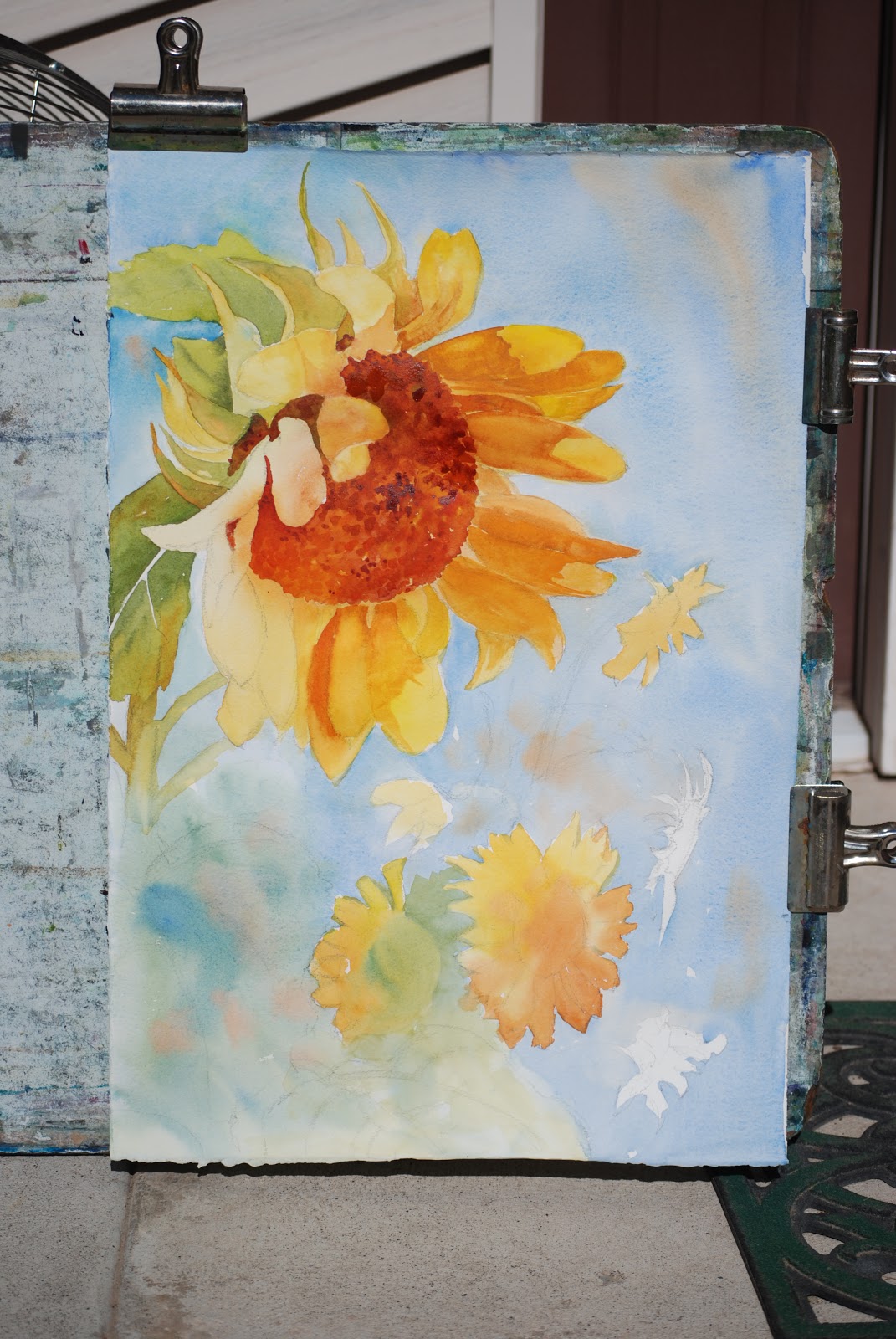
    Here I show my board and the paper being held down with clips. 
    As the paper stretches (and it will) I pull the paper tighter and re-clip.
    I choose not to stretch the paper for wet in wet painting. Simply because I can not put water on the back of the paper to add extra moisture .

    Note the form of the rocks starting to emerge. 
    Also the shape in the large white area is starting to draw my attention. 
    In the next washes I add more shapes in the whites to diminish this shape.
    As one of my great students would say "Its lonely".
    Close up of the resource.
    Here I have drawn in the shapes with a pencil and measured out the masses of the form.  
    In the painting, the Tetons have been moved up, the trees varied and overlapping shapes have been added to the foreground.
    Here the white trunks of the tree have been added by using the bevel at the end of the brush. I almost always start at the bottom of the tree trunk and push up with the handle of the brush. If it makes a dark line its still to wet. It it creates a white line it is still damp and pliable. 
    If nothing happens the painting has become to dry.  
    Magic of watercolor isn't called so for no reason.
    Timing is wonderful, everyone will learn it in one form or another. 
    Its like telling some one what salty taste like. 
    Experience is essential in everything we do. 
    Be it good or bad. Just grow with it happily.
    Friendly harmonious shapes have been added in the back ground whites. 
    Remember the lonely shape.

    Another Great Happy Day. 

    Wednesday, November 9, 2011

    Wet in Wet washes, Taggart Lake Trees


     Note the value study. Middle values are very close the same as the background and the foreground.
    The variation is this piece is the saturation strength of the trees in the foreground compared to the background. 
    Be sure to place lightest lights and darkest dark in the fore ground. This will give the illusion of the foreground appearing close to us.


    Wednesday, September 28, 2011

    The Old Truck and Color Scheme Paintings

    Students this, photo of the old truck can be tweaked. OK orchestrated to meet your personal interests.
    You may zoom in and do a portion of the photo add your favorite shape, line qualities. etc.

    I will use contour drawing from my resource. Be mindful of your format size and your paper format.
    Paper size will be 1/4 sheet watercolor paper.  You are welcome to vary the format size, long narrow, square, etc.

     Fun  
    You can zoom in, crop, etc. etc. etc.

    Sister Ellis I will do the one directly below.
     Here are some other variations.

    Color Scheme Studies:
    Paintings were completed in different color schemes. The first three paintings were completed using the Delicate Triad: Aureolin, Quinacridone Rose and Cobalt Blue.    The last piece was completed using the Desert Triad: Yellow Ocher, Indian Red and Cerulean Blue.


    Monday, September 19, 2011

    Richard Bird Beloved instructor

    Richard Bird lovingly called (Dick) is one of those wonderful human beings that come into our lives and leaves a lasting impression for good.
    He was one of my first instructors at Ricks College now known as Brigham Young University Idaho. My Watercolor experience has been greatly influence by his instruction in the watercolor media and design principles.
    Not only has he taught how to develop an artistic skill but his example of how to live life and love the gifts provided by a loving father in heaven has richly influenced my life.
    Thank you Dick.

    Monday, September 5, 2011

    Great Summer and Featured Artist in October

    September 5, 2011
    This summer has been the best for me.
    Several weeks have been spent painting plein air.

    I also attended two workshops one with Scott Christensen and Charlies Reid.
    One of the great advantages of workshops are the comradeship with other artist one,  watching how some one else holds their brush, mix their pigments on or off the palette a philosophy an attitude the power driven joy of making a piece of art work happen and sharing it.
    Knowing people from around the world. The circle of art indeed is a complete whole it enriches my life.

    I also took my Grandchildren fishing, another world full of joy unto itself. 

    On October 6th I have been asked by the Eastern Idaho Chapter of the Idaho Watercolor Society to be the featured artist, for the annual watercolor show. This is a great honor. The show will be at the Arts Council in Idaho Falls, be sure and look up their web site for directions and time.
    I will put the show on my blog.